Subscriptions 2.0
Subscriptions is an e-commerce plugin application that is used to make recurring revenue easy for store owners. The app gives store owners a way to sell products on a recurring basis and manage customer subscriptions all from with their chosen platform. Currently both versions of the app process millions of dollars worth of subscriptions for merchants including: Lashify, Humanrace, and Liquid Death. Since mid 2018 the app has been fully rebuilt and redesigned while maintaining its user base.
My role
I was first added to the Subscriptions team in late 2017 as the sole product designer until early 2020, since then the design team has expanded to having 2 additional UX designers. Currently I am collaborating closely with with a team of: two product managers, two UX designers, two QAs and a growing team of 30+ developers. Early on I led the design of the overall user experience and interface, to design an app that was seamless between platforms. I facilitated in early stage discovery, planning, brainstorming, and exploration of the entire project. Along with creating high fidelity mock ups and prototypes for developer handoff.
Problem
Version 1.0 of the app was originally built on the Shopify platform and in mid 2018 we planned to relaunch the app on additional e-commerce platforms. For much of the lifespan of the original app, the app struggled to scale along with its growing user base. Without consistent design guidance, proper user research, and overflowing requests for features, the app quickly became over encumbered. App usability was challenged, features competed for focus and overall app reliability and performance issues became a liability.
Upon inspection, the existing developer team determined that it would be easier to build a new application than it would be to make the current one work for another platform. This created an opportunity to rebuild the application and introduce a new design system that was slowly being released across our app suite. With this information, the plan was to rebuild and design the application from the ground up with the intention to become platform agnostic, so that we could create a flexible subscription base and expand our user market beyond Shopify.
Our challenge was to create a scalable admin interface that could be used across multiple e-commerce platforms and to simplify and recreate the magic of creating a seamless subscription plan without any unnecessary features. We wanted to ensure that we were creating a modular interface that could have features removed or added depending on platform limitations. The storefront portions of the app were also designed around the same limitations but also designed to be fully customizable using CSS for a fully customizable experience.
The high level design goals for this project were:
- Create a compact and scalable admin and storefront experience.
- Make the app accessible for anyone and everyone on any platform.
- Give users a seamless and customizable subscription creation experience.

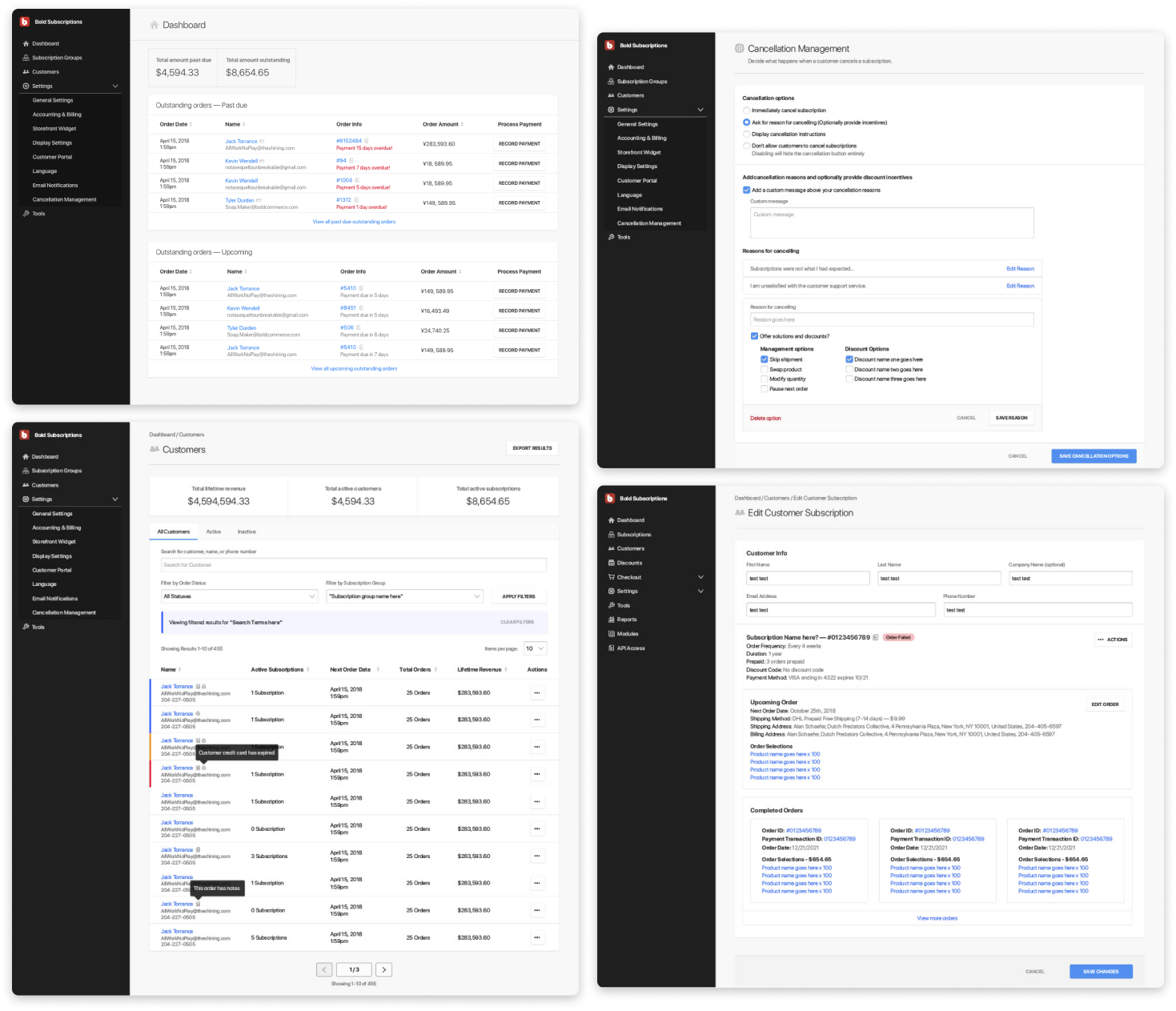
Early phase page layout options and feature breakdowns from design sprint sessions.
Constraints
Our given timeline was to rebuild an entirely new app on a new platform in about a year. Starting summer of 2018 and releasing in spring/ summer of 2019. The original feature scope document listed almost 20 pages/ features to be built out and designed in this time span. Our target MVP was simply to release a well designed and working product; not necessarily offering the exact same V1 features. This was due to being more deliberate about adding meaningful features and changing how we framed and offered subscriptions in the application.
Being platform agnostic - The biggest restraint here was not building features around specific platform functions. We were designing and building the app to be released on BigCommerce first and then eventually release the same version to other e-commerce platforms later on. One of the main constraints the comes along with building an app without a main platform is that we couldn't rely on every platform using the same technology and terms. The entire app must be modular and configurable so that features or functions could be easily removed if it didn't work on a specific platform. We created our own global language system for all platforms. We did research on familiar terms across platforms and created our own terms to be used within the apps to ensure clarity across all user perspectives.
Building for multiple new platforms needed lots of research and discovery work to determine overlap for things like: terms, functionality, user flow, and store setup - mainly to understand the platform's limitations and what the customer journey would be like from setting up a storefront from scratch to the installation and setup of our app.
Storefront restrictions - Each platform has different storefront installation processes. Our app contains a storefront portal for customers to use and certain platforms had limitations over how much of the storefront we could control and what kind of information could be accessed through our portal. The same customer portal existed in our admin also so ensuring the layout was flexible enough for user permissions and additional admin features was deeply considered for this portion of the app.
More platform restrictions and access to information - Again similar to our storefront portal, the admin side had similar constraints all different for each platform but some common pain points were accessing customer and product information and processing subscription payments. For most platforms we kept the UI layout the same but certain features and pages were hidden due to platform restrictions.
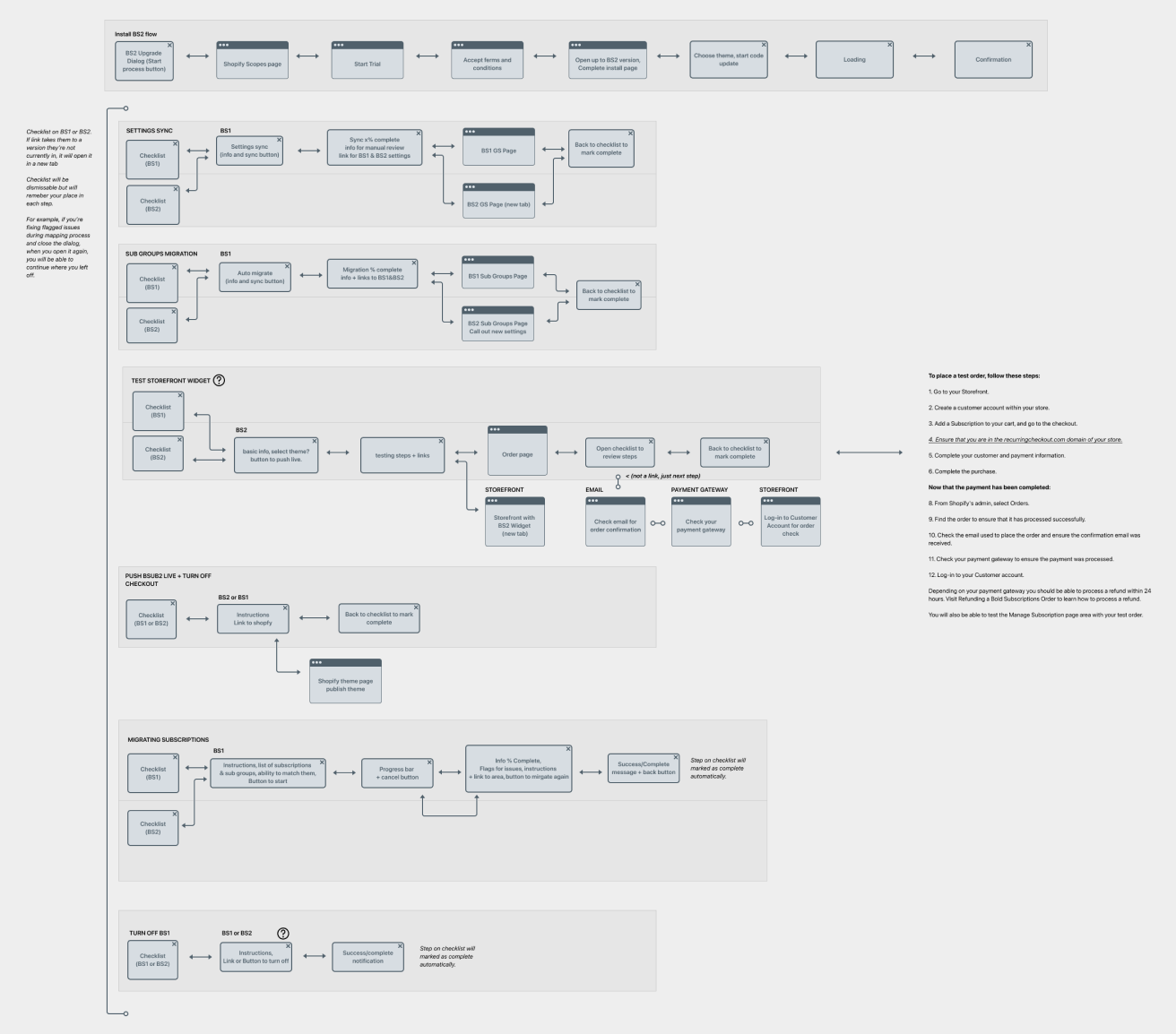
Legacy migrations - Not everyone will be eligible to upgrade to V2. Older users using legacy plans or unsupported features wouldn't be able to migrate, due to us changing the structure of our subscriptions. Those that are eligible to upgrade should have a seamless migration process and those that stay on V1 should have proper developer support.

User journey map diagram showing the migration process from Version 1 to Version 2.
Process
*Since this covers the span of an entire application, this is just a high level overview of my design process.*
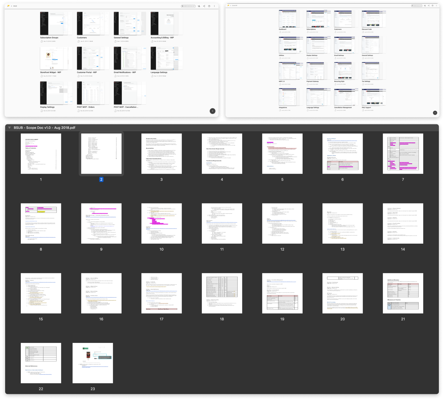
First off a features scope document was created by our project manager. Listing out the project overview, assumptions and considerations, key functional requirements, platform references, and finally a breakdown of milestones and project timelines. For the first week of planning, this document was discussed and broken down by developer and design leads to determine feature feasibility and value. We were able to narrow down the planned list of 20+ features and pages from the scope document and V1 application. From there we were able to determine our MVP requirements and start the backend development and design process.
Additionally we were also conducting supplementary user research and building and updating our design system. Using our previous version, I sorted through the application, noting all design patterns, components, and use cases. Using this documentation of our previous design patterns, I was able to easily update the new design library with an updated pattern that solved for the new solution. On the research side, we were consistently sending out user research surveys to gauge frequently used features and pain points. Along with this we referred to session recordings from supports calls and heat map software to determine exactly how users were using our previous version.
The major key features in our scope document were broken up into their own individual design sprints that usually spanned the course of 2 weeks or less, covering everything from research, brainstorming, mind map sessions, and wireframing to final high fidelity mock ups. Generally the first half was spent handling research and discover with stakeholders and final half for high fidelity mock ups. This initial portion was usually broken down into 3 brainstorm sessions:
Session one: Understanding, identifying and then defining problems
The general goal of this day would be to solidify the problem statement for the specific feature. To start off we would refer to our product vision which looked like: "How might we provide merchants with the most powerful and flexible recurring billing solution?" This served as our baseline when framing the feature. As a team we discussed what a successful feature would look like from all perspectives; starting with the user perspective, reflecting on past user complaints and requests, and accounting for business and stakeholder goals. From here we were able to define the problem the feature would be solving and loosely set goals to determine what success looked like for this feature. Finally everyone individually wrote out their own problem statements for the feature and the questions we wanted it to solve. From here everyone openly discussed their problem statements and we created an affinity map to organize each statement by common groupings. With this we were able to see patterns in solutions we wanted to offer and if the solution wasn't abundantly clear we would take votes to determine the top 3 problem statements we wanted to solve for. The main criteria we were looking for was: what's important to the customer, what's the beneficial for the company, and what displayed flexibility among platforms.

The many pages of scope documents to analyze each feature and mock up reviews.
Session two: Brainstorming and gathering solutions
Now with our problem statement, this day was meant to gather a wide range of ideas and solutions. We started with discussing existing UIs and patterns that exist in any other application that may have a similar feature. They spanned from being unrelated to subscriptions entirely to being a competitor in the same market. These all spawned discussions of usability and complimentary ideas. Using the gathered inspiration and discussions we were able to identify feature standards and patterns that we could reference later on in the ideation portion. With these ideas in mind we were able to frame and stitch ideas together for specific parts of the feature, what it would look like and further refine on functionality. The take away for this day was to stretch our solutions as far as possible, which led to UI solutions and potential feature explorations

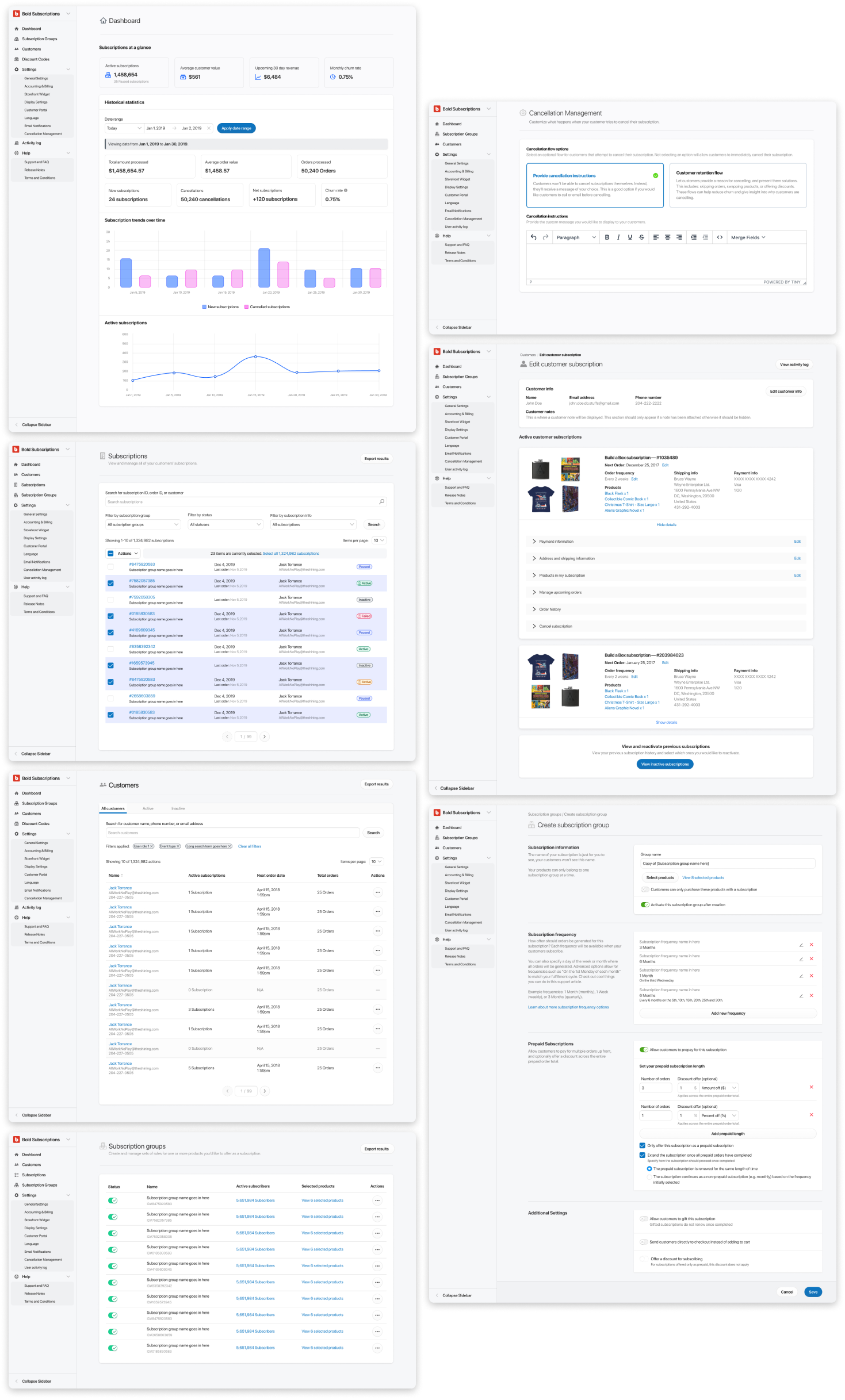
Initial rounds of high fidelity mock ups and page layout explorations.
Session three: Voting, identifying and further refining selected solutions
Given the timeline, if there was time for this session, wireframe solutions and sketches would be presented during this session. I would loosely design multiple solutions based on the previous session and present them to the product team for discussion. Key sections were sometimes pointed out and stitched together with another but discussions were mainly around opportunities for flexibility, flexibility, and technical risks and challenges. After discussions we would vote for a final solution that would lead use towards the goal and solving the problem statements set in the first session. Finally after these three sessions, I would be left with a fully fleshed out solution and ready to begin working on the final mock ups for development.
This cycle was then repeated for each additional feature. Sometimes repeated for the same features or in a more condensed format depending on the scale and timeline.
Takeaways
Embracing change - Throughout the lifespan of this app change has always been challenged as a risk. Technologies change, markets change, contexts change, and customers are always changing. So when we finally decided to rebuild the application we took all the steps necessary to measure the challenges and get it right. Building everything in iterations, releasing often, and getting everyone involved in the process as early as possible. All the large scale changes from V1 to V2 proved to be an immense learning experience for myself and the company. It set the standard and showed the value of design sprints, it paved the way for the building of a new design system and new patterns, and served as one of the companies first examples of a platform agnostic application.
Design sprints work - Design sprints worked as a model of efficiency when framing problems and creating solution and proved to be a precious time investment. Allowed all collaborators to brainstorm and align ideas quickly and create a common understanding across the team. This was one of the company's first attempts at a design sprint for a project of this scale and it allowed us to show its value and efficiently define a large amount of features in a tight timeline.
Simplicity is worth fighting for - Narrowing down the scope and engaging stakeholders early in the planning process is key to narrowing down explorations and solutions. All stakeholders have different goals and ideas of what a successful product looks like. Getting them involved early on is essential for the design process and defining a common understanding for the final product.
