Loyalty Points 2.0
Overview
Loyalty Points is a Bold Commerce application that is used to make customer retention easy for e-commerce store owners. It allows customers to earn points through customer loyalty and engagement such as: purchases or referral invites.
From late 2017-2019 I was the sole product designer for a rebuild of the Loyalty Points app at Bold Commerce. As the only product designer, I was responsible for handling both the UX research and UI rebrand challenges. Throughout this case study we’ll talk about the process of how our small team of 3 developers and 1 product manager went about rebuilding a legacy application from scratch and what we’ve learned as a company.
Low fidelity mock up explorations for the storefront widget.
Problem
While the app was previously successful we were beginning to lose majority of our users to competitors as we had fallen behind in both features and was generally just outdated. App support was overrun with usability complaints and too much technical debt was built up over the years that even caused us consider axing the app entirely. The app was losing money and our supported features were out of date compared to our competitors on the market.
While we were mainly targeting smaller businesses our company was pivoting to a larger scale model to target more profitable merchants and the app needed to follow suite to remain competitive. Loyalty Points was among many rebuilt apps at the company but it was also the first large application to undergo the process. So while rebuilding an application is a big deal, this rebuild was mainly used as a test to upgrade an outdated app and make it profitable in the process.
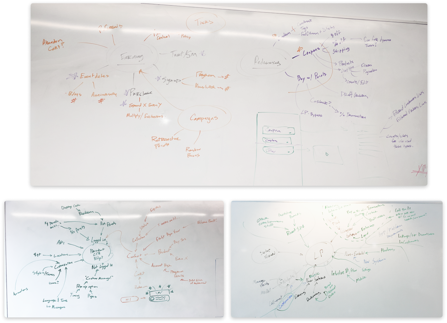
Force map notes from initial brainstorm meetings to break down elements of features and pages.
Refined notes of the force map brainstorm findings.
Constraints
Shopify technical restraints - At the time we were only developing apps for Shopify, so we had to consider a lot of technical constraints out of our control. #1 we needed some control of the checkout to be able to process Points as a form of payment. #2 we wanted our storefront widget to be as customizable and smart as possible. Being able to pull data and information from Shopify’s storefront backend proved to be a difficult task.
First time building a persistent storefront widget - Previously our company had only built single page widgets or integrations on the checkout page. Being that this was a style of widget that we had no experience designing or building for this had given us the opportunity to think about and create a component library for our storefront widgets.
One year timeline - Starting in late 2017 our timeline was set. Our small team of 3 developers, 1 designer and 1 project manager were to experiment with limitations and have a functioning and marketable app before the 2018 Black Friday/ holiday season, as that is our most profitable quarter and when the application generates the most revenue.
Learning about the app upgrade process - Because this was a rebuild of the application we couldn't simply turn V1 into V2. We were planning to rebuild entirely how the application would function, we were pivoting the app from only working as a checkout integration into a checkout and storefront widget. This is would become an entirely new app and listing on the Shopify app marketplace. This was the companies first attempt to learn about the app upgrade journey for customers. This was unknown territory from a business and developer perspective of how we would plan to migrate customers from version 1 to version 2 seamlessly.
Migration risk - The risk with any rebuilt application is losing customers in the migration process. So our plan was to have a seamless migration and upgrade process and to make sure that we had feature parity with the previous version when Version 2 of the app was launched.
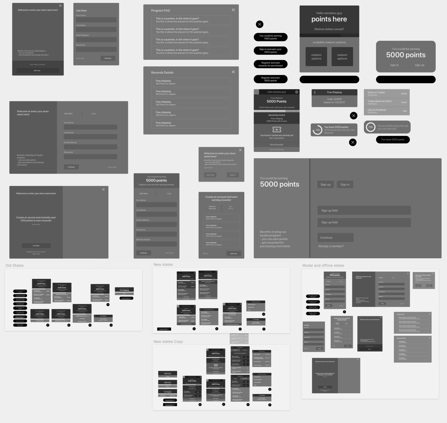
Early phase low fidelity explorations of the storefront widget.
Metrics
Here’s the predicted outcome we’re designing for — The general product vision was to increase our merchant's repeat customer purchases by offering a powerful set of retention tools and features. We planned to increase active users by creating a unique set of loyalty features to differentiate our Loyalty program from competitors and to decrease the number of uninstalls after the free trial period. We planned to do more user research on our pricing structure to provide more meaningful app features at a reasonable and scalable price tier. Our predicted outcome was to increase the number of active users and decrease our installation churn.
How we are measuring success — Our main measure of success throughout our project was to increase the number of paying application users and reduce user churn. User churn was always a big issue for the previous version and we found users were dropping off after the free trial period. With this metric we wanted to track that we had a competitive pricing and feature structure, with a focus on pushing for more enterprise level users. Using these numbers, we would be able to look into detailed statistics about each pricing tier such as: where users were dropping off, how many users were at each pricing tier, and how long users have been using our app before upgrading or downgrading their pricing tier.
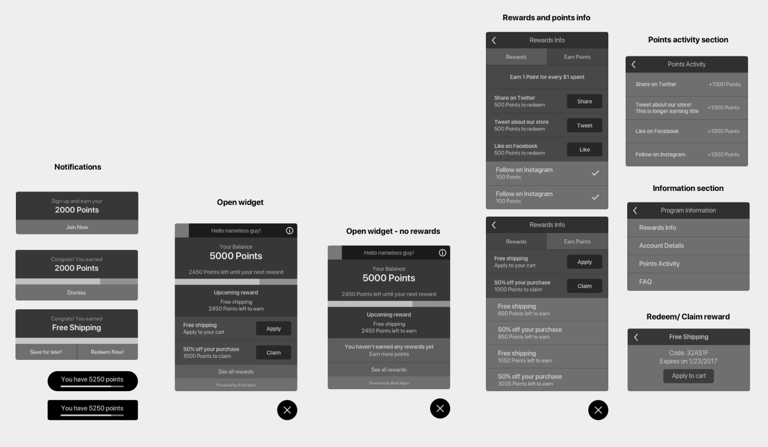
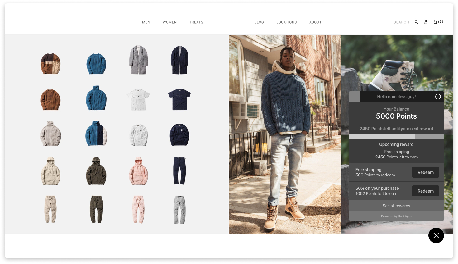
The selected low fidelity explorations that were used as reference for the final storefront widget.
Process
A large part of the process before jumping into high fidelity mock ups was framing the migration process from V1 to V2 and plenty of brainstorm meetings with developers, our support team, and company stakeholders to determine app structure and key features for the app launch. Actively reaching out to our V1 users for research calls and working with our support team to keep track of common complaints or request for the previous version. We reached out to customers that had left low review scores for the app on the Shopify marketplace for both user feedback sessions and user testing of what we had planned for Version 2. We also sent out feedback surveys to those that recently uninstalled and provided them with the option to hop on calls to provide feedback on Version 1. Through hearing feature validation from both users of version 1 and feature requests and complaints from our support team, we were able to figure out what key features our app was missing and what was needed for launch to satisfy our customers needs. By the end of our design sprint process we had a fully fleshed out and user-backed list of features that would put our app in a competitive position on the Shopify marketplace. With this knowledge in hand, I dove head first into wireframing to validate user flows with stakeholders and finally high fidelity mocks and prototypes to determine the final look and feel of our new internal design system and storefront widget.
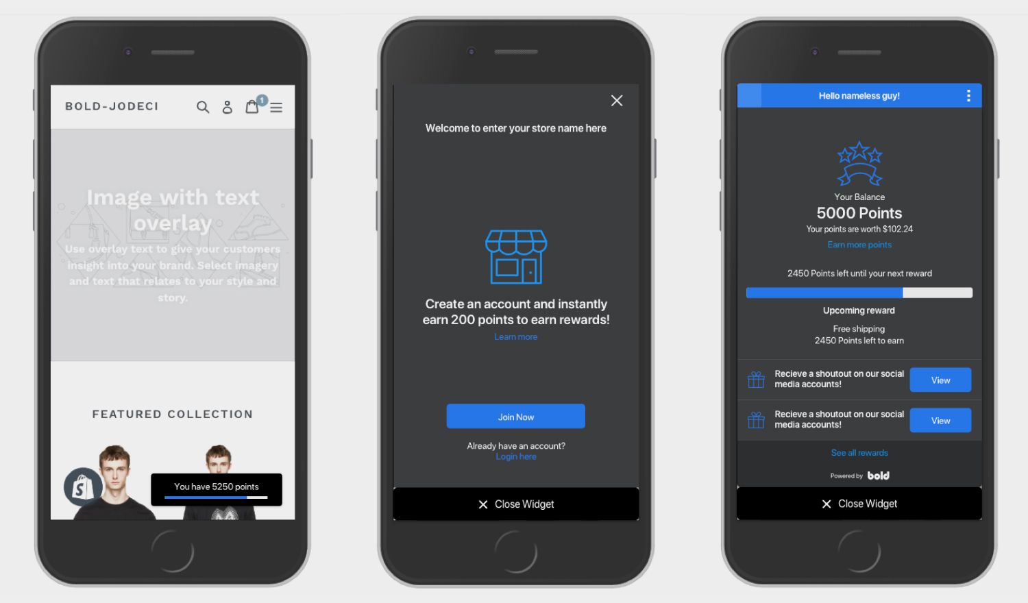
Early mobile prototype example of the storefront widget and the initial widget screens.
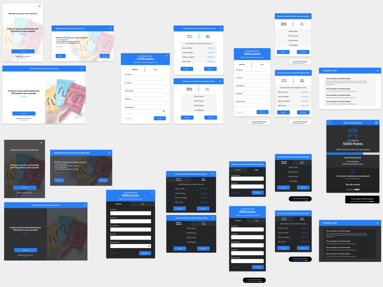
The final high fidelity mock ups of the storefront widget and the various use cases.
Challenges
As you can imagine with a tight timeline and small team, not everything was able to be built exactly or tested accordingly. Because this we didn't plan accordingly enough for the features beyond what we had planned for launched. This mainly effected the storefront widget and how many features it would fit later on in the apps lifespan. It wasn't fully mobile responsive at launch and this was later corrected but the spacing for features was already an issue.
This app redesign was very much an experiment and validation for our company's app UI. This app was used as the baseline to create patterns for our new design system and test out new components and user journey methods. Majority of the app was designed without a design system in place or designing and creating the components on the fly. A lot of aspects of this app pushed our company beyond their comfort zone and allowed me to try different things as a designer. This is one of the only apps of the Bold app suite that is predominantly a storefront widget and has a external setup wizard flow for migration and quick installations.
In hindsight, a lot of the design challenges that occurred later on in the apps lifecycle were because of inefficient planning and not enough design sprints to plan out different iterations of the app as it grew. If we were to rebuild the app again more thought would be put into ensuring that the storefront widget was built with its own design patterns in mind and as modular as possible so that it could continue to grow as features were added. The same goes for the admin side of the app, I would have planned out more of the design system and explored more UI patterns in the discovery phase before jumping into the high fidelity designs.
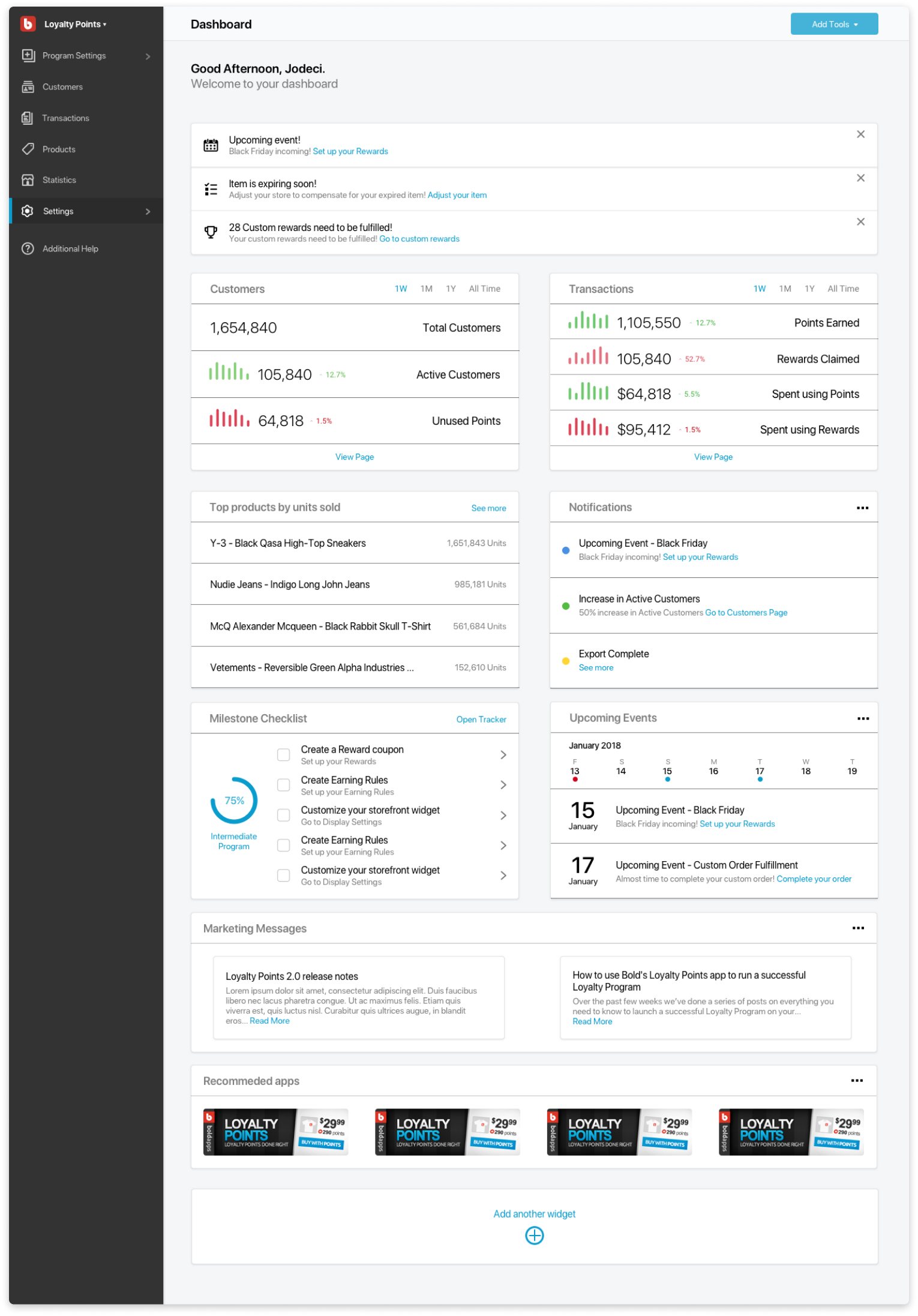
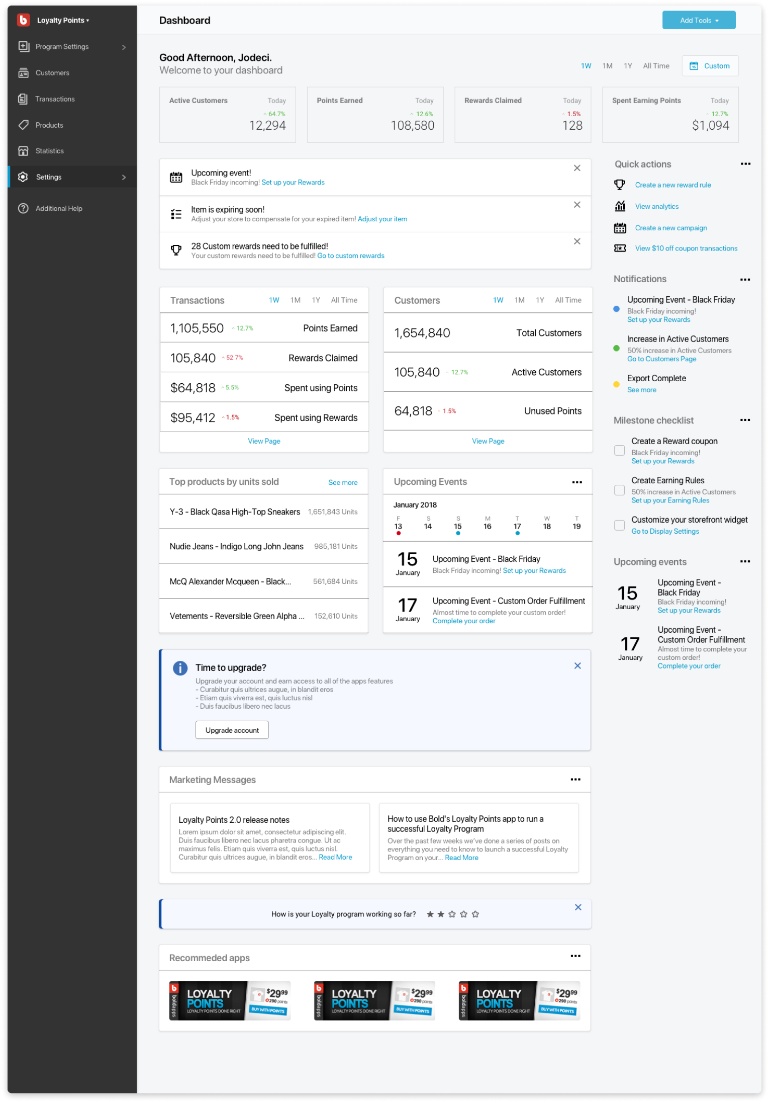
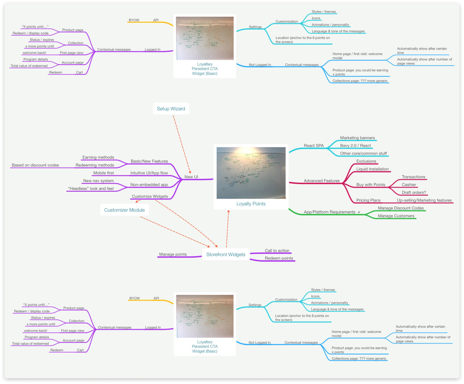
The selected few of dashboard explorations. Exploring layout and variations on data displayed.
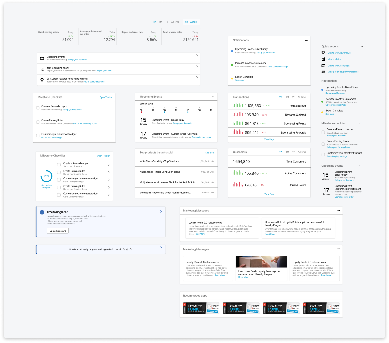
A collection of various components created during dashboard and report explorations.
Solutions
In the end, our launch date ended being pushed by a quarter for technical reasons but despite being launched during our typical dry season for installs, we a saw an increase in all of our targeted metrics. Our user growth increased by 37% in its first quarter of being released and along with this the apps earnings were also increased. More users were upgrading to our paid tiers and the number of active users were up 64% and the numbers of users that kept our app for longer than a day was up 79%. From a metrics standpoint our app succeeded for all the metrics that we planned to hit. Our user installation churn was decreased and our total number of users was significantly increased.
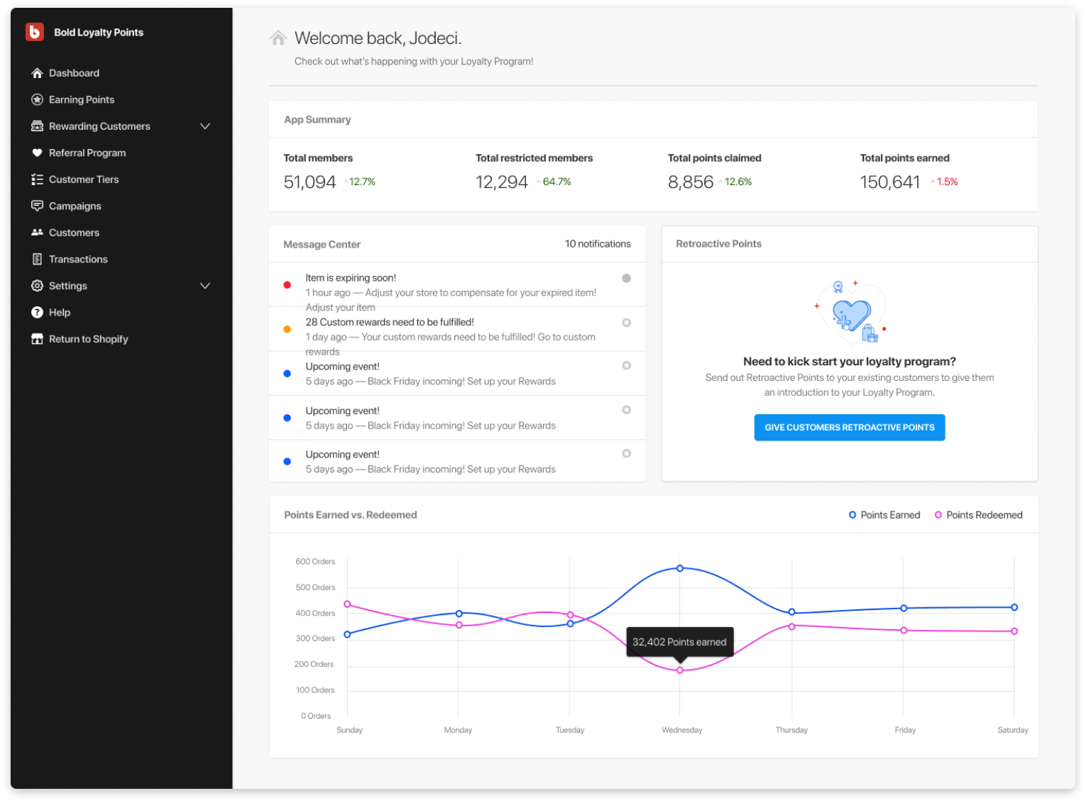
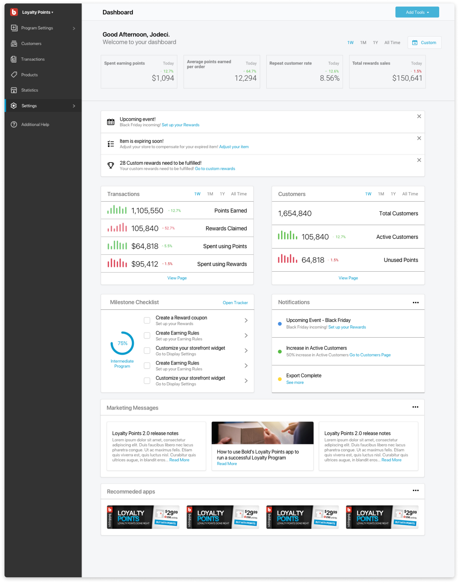
The final mock up used for the MVP release of the dashboard.
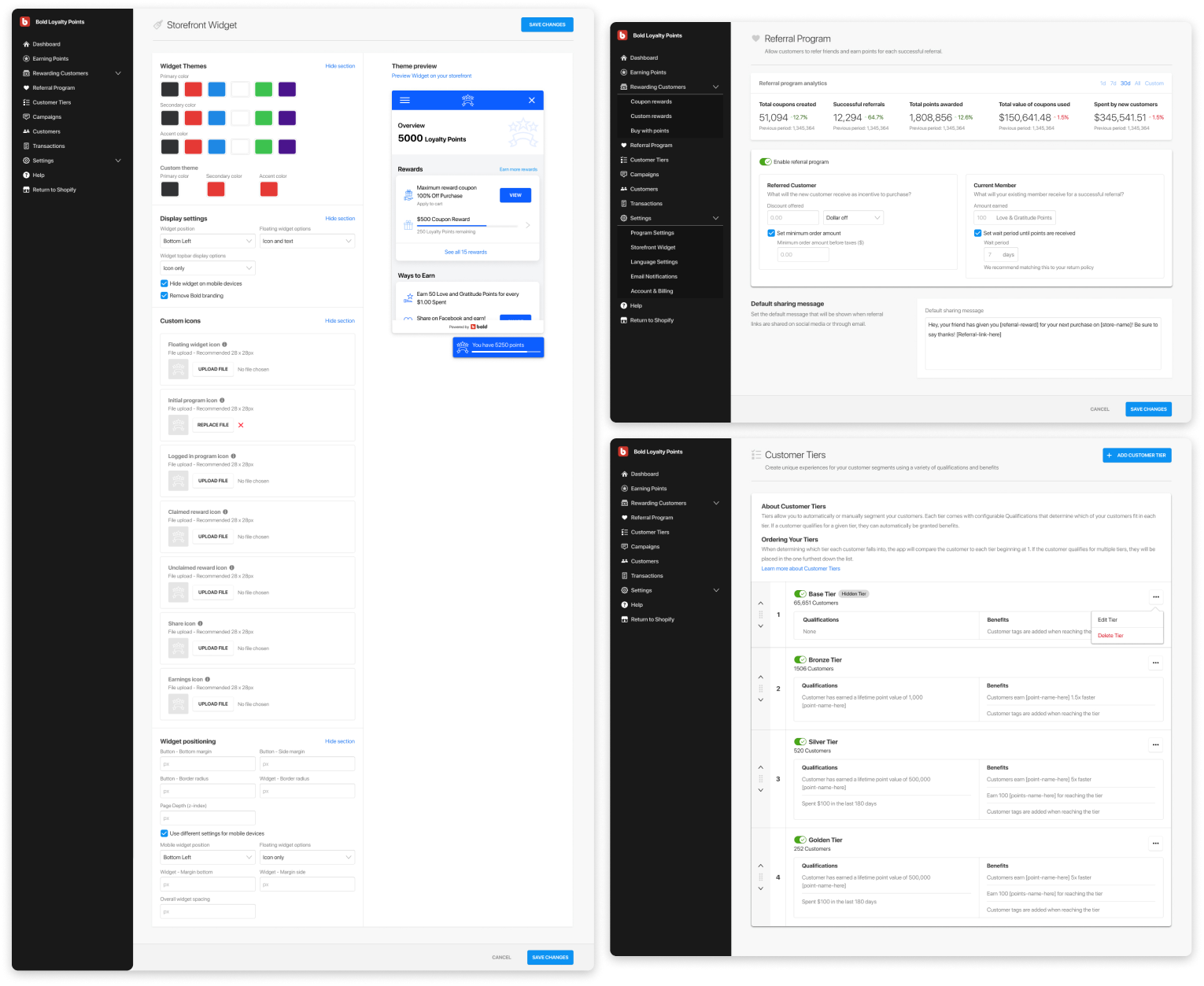
High fidelity mocks used for the Storefront Widget customization page, Referral feature and Customer Tier feature.
